Sue Robb of 4Children talks to Julie Laughton and Alison Britton from the Department for Education about the role of childminders in delivering the 30 hours free entitlement.

Birmingham City Council: From zero to hero
Paula Buckley, assistant director of customer services at Birmingham City Council, looks at the importance of creating immediate dialogue between authority and residents through an easily accessible and mobile responsive council website
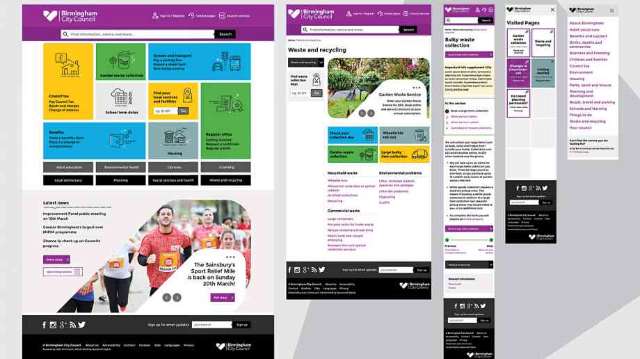
Birmingham City Council’s old site had been built in 2009, had cost a significant amount of money and been subject to a significant amount of criticism. There had been a number of attempts to improve it but it just wasn’t working for the people of the city. This was particularly apparent as almost half of site visits came from mobile devices, yet the site was not mobile responsive. Radical changes were needed. Recent figures show 57 per cent of visits are from mobile sites.
When I joined the council, it was in the final stages of procurement activities including soft market testing for a new CMS and website design at the end of 2013, with a formal Request For Information in 2014. Spacecraft Digital was chosen to lead an entire rebrand and build of the website. The Leicester based firm has been behind many of the most successful government websites, including the much celebrated Manchester City Council site, which itself had been awarded Official Honouree status at the 2014 Webby Awards.
The project started at the beginning of 2016. There was a lot of stone turning and criticism after the last website, so to be certain the website met people’s requirements there was considerable work to be done to make sure we were engaging as many people as possible. It was imperative that the people of Birmingham were involved every step of the way.
Together, we spoke to anyone and everyone that was willing to speak to us. This included citizen panels and people on the street, whilst we also took iterations to Birmingham’s ‘Impact Hub’, a community centre within Birmingham made up of social enterprises and tech start-ups. We did drop in sessions with community groups, we conducted workshops with services and gave out links for people to test the site before go-live. We also had a cross party working group, which was hugely important in making sure everyone felt involved, regardless of political allegiances. You name it, we did it.
Confusing internal terminology
One of the the biggest things that came out of the process was that citizens struggled with how some services linked. There was also a lot of head scratching around internal terminology that had crept into content and structure of the site. ‘Transitional services’ for example, was a term that confused many. People simply didn’t know what it meant.
Another example that sticks with me is of residents trying to apply for a white line to stop people parking outside their driveways where they had a dropped kerb. This had been in the highways section and was labelled as a ‘H bar’, which was not a term residents were aware of. It was also not in the place they expected to find it. To combat this, the search term ‘white line’ was added to the content. It sounds simple, but making sure common search terms are used, updating names of categories and linking from related tasks vastly improves the user experience.
Information architecture
It’s really important that services on the website are grouped around the citizens and not the council’s structure. But this needs buy-in from the services themselves. There was very much a belief that the website belonged to the services and it was about the services putting up information about what they do, but without always being clear about the purpose.
We sat down with different services and looked at ‘life events’ rather than service areas, asking what people would need to know if they were having a child, moving home, getting married and so on. People from different services attended and we asked them to put things into different ‘life event’ buckets. This was hugely important in getting those within the council to think about the structure of the website in a different way, and not just on behalf of the services they are involved in.
So for example, if we’re talking about benefits, it makes sense to have information about free school meals on the same page, but historically school meals had gone with schools only.
We started thinking out governance - who should be writing for the web? We started to move that within the web team and are now at a point where people in the services are responsible for the accuracy of the services information and ensuring it is up to date. They have the knowledge, but don’t write it, and don’t get to influence how it’s written. The research and feedback from citizens has given the webteam the confidence to challenge the use of jargon, the placement and the amount of content, whereas before the content was written by the services and the team would be overruled.
All of the content has been rewritten to some degree with mobile use taken into consideration in that process. The first rewrite of content was audited once added to the site and then reworked and reworked again. It was an ongoing process throughout the project with many stages and plenty of reviews from service teams, editors and citizens. There is a lot less content now than before and it’s definitely more user and mobile friendly.
Mobile responsiveness and audience reception
Mobile responsiveness and accessibility were absolutely key to Spacecraft Digital’s mission. Mobile frameworks focused on user need, featuring a dominant search field for accessing all content. Spacecraft Digital did a lot of discovery work throughout the process and spent a lot of time with the data of the previous site. User testing was used throughout the design and build process.
Eye tracking played a big part of Spacecraft Digital’s process, once something had been created; it was put in front of people and insight into what their eyes were drawn revealed a lot. This included many things, from the best colour contrasts to where things were best suited on pages. We were able to see heatmaps of where people were looking and test pathways based on specific tasks.
Local authority sites have a duty to serve everyone in the area, working for many different audiences including businesses and citizens across the community. Birmingham City Council is actually the largest local authority in Europe, its website receives over 37 million page views per annum and there are over 100 different languages spoken, and for many, English isn’t their first language. The decision was therefore made to support the english vocabulary with an icon based approach, helping people to navigate through imagery alongside text. The approach had proven popular in the test phase and has worked very well in practice.
Wireframes were created as we went along and presented to users for feedback. Through constant iteration, we ended up with two distinct styles. It meant that when we got to the final concept stages, rather than having several rough versions we had two very honed concepts. Because of the thorough research, we were able to definitively say that people had a preference for a certain typeface, for a certain button design, for a specific layout, and so on.
These were then presented to users and members. We spent a day at council house, going through various committees. And we arrived at a version that incorporated the best of each. Before we went live, we gave everyone we’d engaged with links to take a look and told them to play with it, explaining that it was still in development and saying ‘here’s your opportunity to feedback to us’.
Following various prototypes of site and key user journeys testing, we went live (quietly) in August 2016 and the new site was received positively. In April 2017, the new site was awarded Honouree status in the 2017 Webbys, recognised under Mobile Sites and Apps in the Public Sector and Activism categories, providing great recognition, especially as a core objective in the redesign was tackling a lack of mobile responsiveness.
From an internal and external perspective, the site has been a huge success. The web team enjoy using the new CMS, which is part of the Jadu Continuum platform. Jadu has moved to fortnightly development sprints, so it’s very responsive to industry changes in practice and user need. We also use Jadu’s forms product, XFP and are looking to introduce its CXM, their customer relationship management service.
Our users are finding things easier and more quickly in the new site and that means everything. There are so many benefits, but to give a recent and specific example; there are a lot of taxis in Birmingham and we historically received a significant amount of calls and visits around licensing. People actually had to come in for a 20 page document, that cost £25 to create. We put all the details on the new website, with the appropriate information and couldn’t believe the change .
Recognition is great, but how users experience the site and digital services is by far the most important thing and so far the feedback has been outstanding.

Company Focus
Just Lanyards is a subsidiary name of Gifts 2 Impress Limited, who have been trading for over 25 years, we therefore pride ourselves in having endless experience covering all aspects of the promotional merchandise industry.
Event Diary
UKREiiF has quickly become a must-attend in the industry calendar for Government departments and local authorities.
The multi-award-winning UK Construction Week (UKCW), is the UK’s biggest trade event for the built environment that connects the whole supply chain to be the catalyst for growth and positive change in the industry.
Supplier Profiles
Geo Energy
At GeoEnergy Design, we're on a mission to disrupt the traditional way heating and cooling ha
Latest Features
Professor Harith Alani, director of the Knowledge Management Institute at the Open University explains how AI can be used for good and bad.
Alex Lawrence, head of health & social care, techUK sets out techUK’s Five Point Plan for CareTech.


